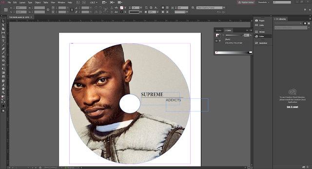
Measurements of CD cover:
For PhotoshopFront cover & Back Cover:
139mm x 125mm
Spine:
6.5mm x 125.5mm
How I made my Album Cover:
First, I customized the size of the page so that the width was longer than the
height, in order to mimic the actual measurements of a album cover. Then I
split the page in half and drew a black line down the center, to imitate
the spinal cord of a album. After picking the image i wanted for the front album cover I placed the picture onto the left-hand
side, also I did this with the right hand side.
Font:
I spent time looking at the different fonts to see which one suited the theme and genre of Rap, which is bold and straight. i wanted to have bigger than the other in two seperate different fonts.
Why I picked the images i did:
Framing:
Representation of star:
How I tried to attract my audience:
Effects:
I
spent time toying with the fonts. I wanted to settle for
one that helped connote the genre and fit inline with the style of the
cover and song name.
I also googled 'what type of fonts rap CD's and posters used', so that it would appear more realistic.
I finally settled for 'merky records'.
Here I
added the 'Parental advisory, explicit content' logo, as that's what CD
covers tend to include, as a warning to younger viewers of some of the
themes it contains.
Font
why I picked the images i did:
Framing:
representation of star:
How I tried to attract my audience:
Effects:
Font
why I picked the images i did:
Framing:
representation of star:
How I tried to attract my audience:
Effects:


No comments:
Post a Comment